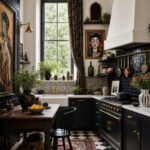

Calm spaces do not come from owning less; they come from what you allow back onto the surface.
A single ceramic bowl on a kitchen island, one anchor object and nothing competing beside it, quiets the eye faster than a full purge.
The cost is daily discipline: the mail pile, the charger, the souvenir mug each have to earn their place, because the moment a surface holds two things fighting for attention, the calm collapses back into clutter.
1. Soft Kitchen Calm
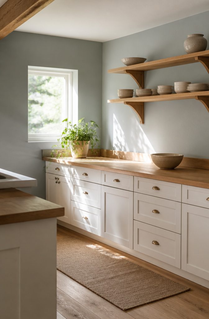
Pale cabinets in warm white or muted grey do the heavy lifting for a kitchen that feels cleaned up rather than stripped bare.
I would pair them with a wood countertop or open shelves in a tone close enough to match, because the repetition is what quiets the eye.
Restraint works better than minimalism: a woven tray, a wooden bowl, or a single trailing plant on the counter, and nothing else competing for attention.
Keep the island or main counter to one anchor object and the whole room reads as intentional.
Natural light matters more here than any fixture. If your windows are small, the pale cabinetry bounces what you have deeper into the room.
I would skip the urge to stage, too. Matching dishware on open shelves looks pulled together when the colors stay within two tones; mixed patterns read as clutter from across the room.
The lived-in quality comes from the materials, not the mess. Warm wood, matte ceramics, and one green stem do enough to keep the space from feeling sterile without adding visual noise that undoes the calm.

CERAMIC trinket bowl, makes a great gift

Artisan Studio Aesthetic: Crafted with a hand-thrown feel, this decorative bowl brings artisan elegance to your home. Its speckled matte finish creates a serene, modern vibe that elevates any space instantly
2. Sculptural Serenity
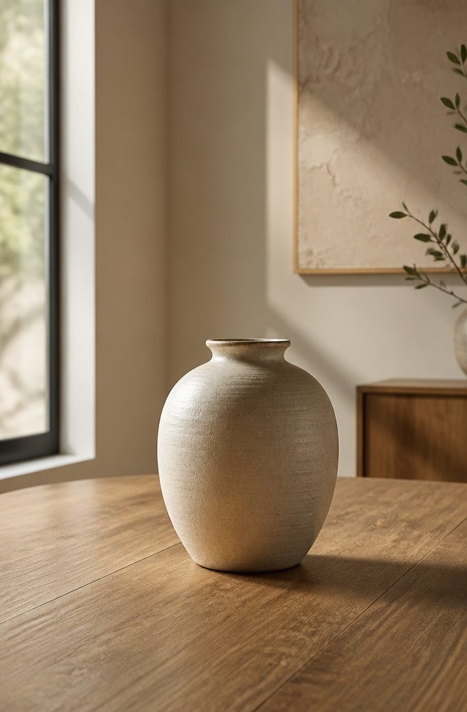
A single smooth vessel on an empty surface does more work than a shelf full of objects.
The eye lands, rests, and stops searching. That is exactly what makes it work.
I would pick a curveside chair, a hand-thrown ceramic, or an abstract stoneware piece and let it breathe. Leave the surface around it completely bare.
No candle beside it, no book underneath, no trailing plant to soften the edge. The restraint is what makes it calm.
A large ceramic bowl filled with seasonal green moss works on a dining table.
A matte stoneware vessel on a coffee table holds the same ground. The rule is one object, one surface, and nothing that competes for attention.
This is where most of us fail. We add a tray, then a candle, then a design book, and suddenly the surface is a small museum again.
The one-in, one-out rule for decorative objects prevents this. A new piece means an old piece leaves, period.
Open shelves need the same discipline.
Place heavier items like thick ceramic bowls on lower shelves, delicate forms higher up, and leave empty space around each group. Horizontal book stacks can lift a small object, but the stack itself becomes the pedestal, not clutter.
Your room will look spare.
Visitors might ask if you are still moving in. That spareness is exactly what reads as cleaned, as finished, as calm.

Hinge's variable overlay feature allows for flexibility in how much your cabinet door overlays the frame

Material - Cabinet handles are made of zinc alloy with Brushed Gold finish, which is more stable, while making your cabinets more refined and beautiful.

Eye Protection Warm White Light: The mini indoor Christmas lights set comes with eye protection warm white light and white line, which is great for tree, bedroom, balcony, garden decoration. These 360º sparkling string lights can not only provide good lighting effects but also bring a more romantic festive atmosphere
3. Everyday Neutrals Done Right

Flat beige reads as a mistake, not a choice.
Layered neutrals work because the eye registers differences in temperature and texture before it notices color at all. Warm whites with yellow or green undertones sit against cool greys carrying blue, and that slight opposition keeps a room awake.
I would skip the paint swatch that looks "clean" under fluorescent store lights, because alabaster and pale travertine shift warmer in daylight and collapse into something institutional without that undertone.
Linen and wool do the heavy lifting here. A slubby linen throw against a low-pile wool rug gives the eye two scales of texture to compare, which reads as depth rather than pattern.
Brushed cotton on cushions adds a third, quieter layer. Without this variation, even expensive neutrals flatten into what sources call the "clinical" look.
The washed-out fix is a single darker accent. Not a feature wall, just one weight below the mid-tone: a warm stone basket, a soft linen in shadow rather than light.
It anchors the palette the way a dark sock line grounds an otherwise pale outfit. One is enough; two starts a theme, and themes compete with the calm you’re after.

NSF CERTIFIED FOOD GRADE - This premium mineral oil is NSF certified and lab-tested to meet the strictest food safety standards. Colorless, odorless, tasteless, and gluten-free — perfect for cutting boards, butcher blocks, and all food-contact surfaces.

FOOD-GRADE MINERAL OIL FOR CUTTING BOARDS: Helps restore and protect dry cutting boards, butcher blocks, and wooden kitchen surfaces. Refreshes dull, worn wood and helps prevent cracking or splitting; works on bamboo, teak, acacia, olive wood, and hardwood boards

NSF CERTIFIED FOOD GRADE - This premium mineral oil is NSF certified and lab-tested to meet the strictest food safety standards. Colorless, odorless, tasteless, and gluten-free — perfect for cutting boards, butcher blocks, and all food-contact surfaces.
4. Cottage Utility Glow-Up

Peg rails work in a cottage kitchen because the constraint forces the edit. Hang only the three white enamel mugs that match, and the rail becomes a color block instead of clutter.
I would skip the vintage reproduction hooks with curly ends; the simple Shaker peg or a plain cast-iron hook reads cleaner against beadboard.
Open crockery racks follow the same rule. A wall-mounted plate rack with no cabinet door only stays calm if every piece inside shares a palette.
Creamware, or a single stoneware line in oatmeal, turns storage into a still life. Mix in a souvenir mug from a road trip and the whole thing collapses back into mess.
Enamelware is the cheat code here. The white rim on a navy or cream body gives enough visual rhythm that a row of lidded canisters on a counter looks arranged, not dumped.
I would put flour and sugar in the largest two, keep the smallest for tea bags, and leave one canister empty so the line breathes.
It takes real daily discipline.
This look punishes the plastic pitcher or the mismatched grocery-store water bottle. What stays out has to earn its place, which is exactly why the aesthetic works.

Small Size: 8.3"L x 4.7"W x 1.6"H; Small size, please pay attention to the size before purchase (Only 1Pcs small rattan tray, accessories are not included)

Round Wicker Basket Spec. 1pc 7" small size rattan fruit bowl; Approx Size: D 7 x H 1.7 inches.
✔️ Natural Wood - Our wooden trays for decor are made of premium Acacia wood. We only use 100% natural wood.
5. Laundry, But Make It Chic

A laundry area reads as chaos the second detergent boxes, dryer sheets, and stray socks share the same visual plane.
The fix is one container type for everything: glass jars with wide mouths for powder and pods, woven hampers for lights and darks, nothing else.
I would skip lidded plastic bins here; they look utilitarian and collect grime in the seams.
The palette matters as much as the storage.
One color family for folded towels on a single open shelf does more than match. It collapses visual noise so the wall itself becomes part of the system.
I think white, sand, or pale gray works best because they read clean even between wash days, and they let you spot a stray red sock before it ruins a load.
Visible systems only work if you maintain them, so the shelf should hold exactly what fits without stacking.
A stack topples, and a toppled stack undoes the calm in one morning. For a renter, this is all reversible: a freestanding shelf, a few jars, hampers with handles that move when the lease ends.
The cost stays under $150 if you source the jars from a restaurant supply store rather than a home goods boutique, and the difference in wall thickness is nothing a rubber gasket doesn’t fix.

Effortlessly transitions between serving drinks and displaying flowers

Elegant ceramic flower vase - Crafted from premium ceramic and fired at high temperatures, this vase is meticulously hand-polished to offer a jade-like smoothness to the touch, and the glaze exudes a soft, gentle sheen. The weight is balanced, and the thickened base provides a stable center of gravity, maintaining an elegant appearance, while ensuring stays upright to provide both peace of mind and practicality for daily use

💡Ceramic Vase Dimensions: This vase stands 9.06 inches tall and measures 6.3 inches wide. The opening is 3.43 inches wide. This medium-sized vase is just the right size to meet most of your needs, and it complements farmhouse, vintage, rustic, bohemian, and modern home decor styles perfectly.
6. Elevated Everyday Function
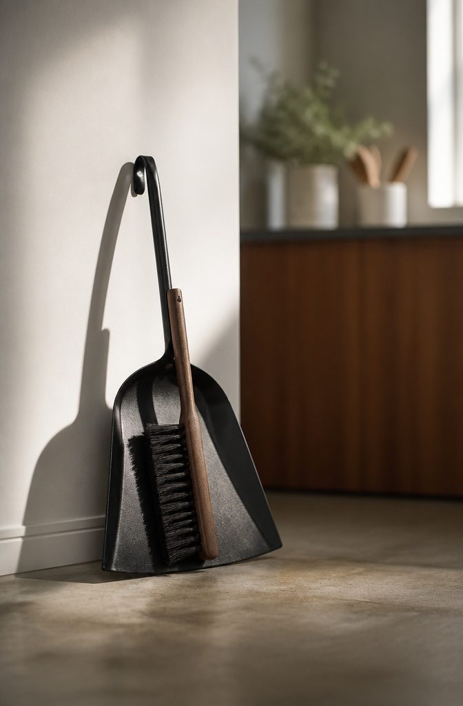
The objects you use every day but cannot tuck away are where a cleaning inspo aesthetic lives or dies.
A dustpan and brush in black metal reads as a single sculptural piece when it leans against the wall, not a clutter of plastic to kick under the sink.
I would skip anything with bright colors or visible logos; the eye catches those first and the calm breaks.
A dish rack that folds flat against the backsplash earns its place in small kitchens where counter space is the limiting factor.
Ceramic holders for toilet brushes cost a few dollars more than plastic bases and they stain less over time, so the upgrade pays for itself in how long you can stand to look at it.
Ceramic chips if you drop it on tile, so this is a pick for renters with steady hands or landlords who will not charge for that kind of wear.
What stays visible should share a material language. Mixed metals fight each other; black metal, light wood, and matte white ceramic can coexist in the same sightline because none of them shout.
I group by finish rather than by room when I am deciding what to buy, and the spaces read calmer for it.

HAND PAINTED FISH-SHAPED BOWL Ceramic serving dish adds artistic coastal flair to your kitchen or table setting

Measures 6.125'' x 6.125'' x 3.375''

Functional bowl use for keys coins or other small items
7. Spa-Like Simplicity
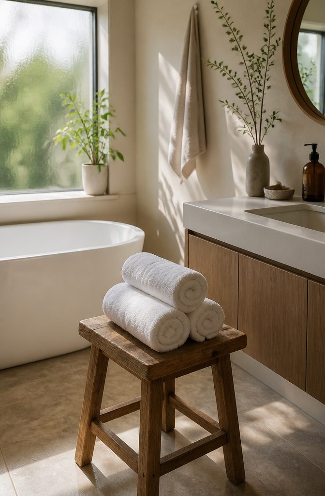
The bathroom quiets down when you stop seeing labels. I transfer shampoo and body wash into matching bottles, amber glass or frosted plastic, whatever reads as one quiet set instead of a shelf of competing brands.
The originals go under the sink or in a closet; the counter keeps only what earns its place.
Rolled white towels stacked on a wooden stool do more than store themselves.
They signal that someone planned this, and that planning is what separates hotel calm from everyday chaos. I use a stool because it takes no installation, costs less than built-in shelving, and moves where I need it.
The rim of the tub and the edge of the sink stay empty. Toothpaste tubes, razors, and the soap dish live in a drawer or a lidded box.
If it does not belong in a photograph of the space, it does not belong on the surface. The ten seconds of putting it away is the whole habit.

【PATTERN DESIGN】 This wallpaper combines ocean elements such as jellyfish, starfish and seashells with bohemian paisley and scroll patterns to deliver an exquisite vintage artistic flair

Hinge's variable overlay feature allows for flexibility in how much your cabinet door overlays the frame

Creative Mini Christmas Lights Set: This Christmas light on white wire set includes 100 transparent mini-lights, a total length of 20 feet of white wires, and each bulb is 2.4 inches apart. It can be connected end-to-end to meet your decoration needs, up to 5 creative light strings
8. Small Room, Big Calm

A small room does not calm down just because you own less stuff.
The real move is restraint in what you add back: one larger piece where you might have lined up three small ones, walls and trim painted the same color so the edges disappear, and storage built flush into the architecture rather than parked against it.
I would skip the gallery wall entirely. One oversized abstract or a pair of architectural prints, hung with the center at 57 to 60 inches from the floor, gives the eye a single place to rest.
Solid wood frames in oak or walnut, or thin matte black metal, keep the material honest; acid-free mats protect the work and add the slight lift that makes the piece feel intentional rather than inherited.
For storage, I think the built-in route wins every time for a renter willing to patch a few holes later.
A window seat with a lift-top lid, a recessed shelf between studs, or a toe-kick drawer under existing cabinets all remove the visual weight of freestanding bins. The room reads as architecture, not inventory.
It takes patience. One large piece takes longer to find than three small ones, and matching trim to walls means taping every edge with care.
You get a room that feels finished rather than decorated, which to me is what the cleaning inspo aesthetic is for: the space itself does the quiet work.

100% BAMBOO: Kikcoin bamboo wooden cutting boards for kitchen preserves the original bamboo grain and texture.The surface is carefully polished and coated with food-grade oil, ensuring a smooth, burr-free finish that resists cracking

Revitalizing blend prevents drying and cracking of hardwoods and bamboo

NATURAL INGREDIENTS – Made with PURE NATURAL ingredients, starting with filtered water, distilled vinegar (you'll recognize the scent), castile soap and therapeutic grade essential oils, nothing artificial!
9. Minimal but Not Cold

A sparse room only looks calm if it still feels inhabited.
Warm wood tones do the heavy lifting here; a pale oak or honeyed walnut surface catches light differently than painted MDF and keeps the space from reading as a showroom display.
I would skip anything with a high-gloss finish, since reflection amplifies emptiness.
One textile with a visible weave, slubby linen or brushed cotton, breaks up the flat planes without adding clutter. The texture matters more than the color; even a warm neutral can feel sterile if every surface is too smooth.
A single plant with irregular growth, something that trails or tilts rather than a symmetrical topiary, introduces the slight imperfection that makes a room feel lived-in rather than staged.
Lighting is where most minimal rooms fail.
Overhead fixtures flatten everything and cast hard shadows. I would place light at face height, a ceramic table lamp on a side table or a brass reading lamp beside a chair, ideally with a warm dimmable LED around 2700K.
That height wraps light around objects and people, which is what keeps a pared-back space from feeling hostile.
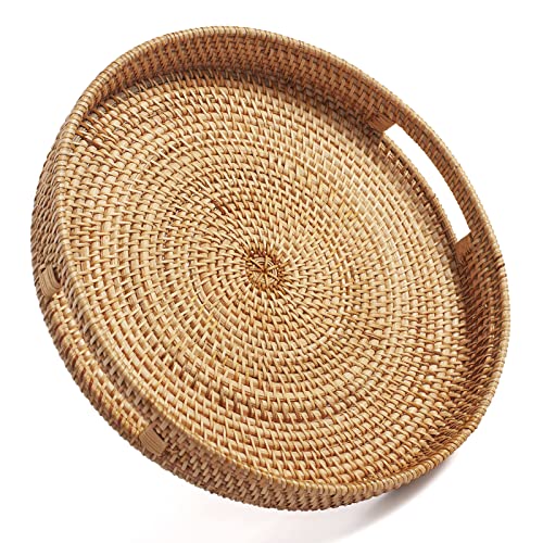
Small Size: 11.8 inch Diameter x 2 inch Height; Package include 1PCS of Circular Tray

【Premium Pine Wood】Made from sturdy pine wood with a natural rustic brown finish, this decorative tray offers excellent durability and wear resistance. The addition of 4 silicone non-slip pads ensures secure placement on various surfaces for worry-free use.

⭐ Beautiful Acacia Wood: Our Wooden Risers for Decor are made of high quality natural Acacia wood and well made, These handmade counter trays add a touch of modern and farmhouse style to your decor.
10. Polished Living Room Ease

Feather inserts make the difference between a cushion that looks slept-on and one that looks deliberately placed.
Down or a down-alternative blend costs more than polyfill up front, but the loft returns with a single shake each morning. That two-second habit is where the cleaning inspo aesthetic actually lives: maintenance, not a shopping spree.
A coffee table needs breathing room to read as intentional, not cluttered. I keep mine to four objects or fewer, with at least 18 inches of clear surface on every side.
The objects themselves matter less than the space around them; a single stack of books with a small tray reads more finished than twelve pieces fighting for territory.
Curtains should touch the floor, not hover above it. An inch of clearance keeps them from pooling into dust collectors, but anything higher and the wall starts looking like a rental default rather than a choice.
Linen panels diffuse light the way heavier fabrics block it, and that softness carries through the room even when the windows are closed.
The polished look these three details create is what I would aim for on a Saturday morning: ten minutes of fluffing and straightening, not a thousand-dollar refresh.

TIMELESS ELEGANCE FOR EVERY SPACE: Refresh your modern rustic home decor with our handcrafted Capri rustic vase for flowers that features a rounded silhouette and dual looped handles. Its compact size (5.5” diameter x 7” height) makes it perfect for small spaces like bookshelves, side tables, and entryway consoles, making it an ideal white room decor piece for apartments, offices, and cozy nooks

TIMELESS ELEGANCE FOR EVERY SPACE: Refresh your modern rustic home decor with our handcrafted Capri rustic vase for flowers that features a rounded silhouette and dual looped handles. Its compact size (5.5” diameter x 7” height) makes it perfect for small spaces like bookshelves, side tables, and entryway consoles, making it an ideal white room decor piece for apartments, offices, and cozy nooks

Unique Ceramic Glazed Design: This decorative ceramic vase with unique glazed design.The modern farmhouse vase can be used with faux flowers, fresh or dried flowers as decorative pieces for any room's decor.
11. Softly Layered Bedroom Calm

A bed that reads as calm rather than staged starts with linen in a warm, mineral tone like alabaster or pale travertine, not stark white.
European flax linen drapes with that intentional rumple; it looks relaxed because it is, and it breathes better than cotton on nights that turn warm without warning.
I fold a cotton quilt, waffle-weave if I can find it, across the foot of the bed for weight and visual anchor.
One wool throw, low-pile, goes on top, but only one. The pillows matter more than people think: a mix that compresses to different heights, so the bed slopes rather than stacks.
Graduated texture, not pattern, is what you want. A slubby linen throw against brushed cotton covers adds depth without the clutter of prints.
I wash the linen on gentle with a plant-based detergent, tumble dry low with wool dryer balls, and pull it out still slightly wrinkled. Perfectly pressed bedding reads hotel; this reads like sleep.
12. Sunlit Kitchen Simplicity
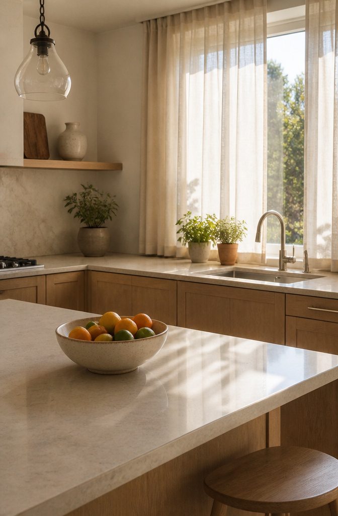
Sheer Belgian linen panels diffuse sunlight without blocking it, and that difference matters more than any fixture you could add.
I would skip lined curtains entirely here; the unlined weave lets light move through the fabric instead of dying at the window.
Pale countertops bounce that light deeper into the room, so the space reads brighter not because of stronger bulbs but because there is simply less to absorb or shadow.
The kitchen island is where this usually falls apart. One day it holds a mail pile, the next a charging station, and suddenly the surface that should reflect light is catching it in ridges of clutter.
Keep the island to one anchor piece — a single ceramic bowl, a travertine tray — and the light keeps traveling.
Cleaning becomes easier because there is less to move, and the room stays calmer because the eye has fewer places to land.
Windows need actual attention, not just the look of it.
A film of winter dust drops the Light Reflectance Value of the glass itself. I would clean panes on an overcast day; direct sun dries the solution before you can wipe it, and streaked glass scatters light unevenly.
13. Tailored Utility Chic

Pegboard with tool outlines traced in marker or vinyl is the move here, borrowed straight from garment studios where scissors and shears each have a labeled home.
The boards look sharp because every item snaps to a silhouette, not because the pegboard itself is expensive.
Canvas bins with leather pulls add the softer half of this pairing; they hold office supplies or makeup with the same visual logic as a pattern table holds bolts of cloth.
A desk with nothing loose means a single drawer for daily tools and a habit of returning them, not a minimalist’s empty surface for show.
The calm comes from the fit, the way a well-drafted sleeve sits in its seam. Outlining your own tool shapes takes 20 minutes with a marker and costs nothing, and a glance tells you what is missing.
I would skip the actual sewing-machine aesthetic unless you sew; the pegboard reads as intentional utility in any room.
It is rigid. This system rewards consistency, so if your tools change monthly, the outlines become lies you stop believing.
14. Neutral Living Ease

Greige walls read as color without shouting for attention, and that quietness is what makes a living room feel clean before you ever pick up a vacuum.
I pair them with warm white trim, the kind that carries a drop of yellow rather than blue, so the edges stay soft even in afternoon shadow.
Charcoal comes in last, through a sofa frame or the metal legs on a side table, just enough to keep the eye from floating.
The discipline is stopping at three. A fourth color, even a muted sage or blush, turns the room into a composition you read all at once.
Three neutrals let you notice the texture of a linen pillow or the grain on oak shelving instead of chasing contrast.
It looks boring in a photo, maybe, but lived-in it feels like a held breath. I would skip the accent wall entirely; one painted rectangle breaks the rule without adding enough interest to justify it.
15. Moody Minimal Retreat

Dark walls read as clutter faster than light ones, so the restraint matters more here.
I would stick to deep charcoal or forest green as the single strong gesture and keep everything else quiet. Pale oak or birch underfoot, one brass lamp or sconce, and no competing warmth.
The mistake I see most is treating a moody room as a license for layers: patterned rugs, gallery walls, mixed metals. Each addition breaks the calm this palette is meant to create.
Light sources need to sit at multiple heights or the space goes cave. I would place a low table lamp, a mid-height floor lamp, and something overhead that washes rather than spotlights.
The brass serves as the single warm note, but it should be thin hardware or a slender base, not a statement piece.
Surfaces stay bare by habit, not by chance: a drawer system or a basket for the daily drift of objects, so the walls stay the focus.
16. Warm Modern Living

A low sofa with rounded arms reads modern without feeling like a showroom display.
The curve breaks the line just enough to keep the room from turning clinical, and it still sits clean against a wall if you are working with 12 feet of living space and a door swing to account for.
I would pick boucle or a washed linen blend for the upholstery; both read warmer than a tight weave and they forgive the kind of dust that shows up on camera when you are trying to film a quick vacuum pass for your own cleaning inspo aesthetic reel.
Travertine on the coffee table adds the grain and pitting that a lacquered surface would erase.
It stains if you leave a coffee ring overnight, which I consider a fair trade for the texture it brings in. Oak floors with visible grain do the same work at scale.
I would skip the factory-finished ultra-matte planks that are trending right now; they look like vinyl under overhead lighting and they show every scuff when the afternoon sun hits them straight on.
A site-finished floor with a low-sheen oil-based polyurethane carries the tone better and repairs in patches instead of whole-board replacements.
The geometry stays sharp in the frame of the sofa and the square plane of the table. The warmth comes from what those shapes are made of, not from softening the lines themselves.
17. Elevated Bedroom Neutrals

A headboard that reaches at least 6 inches above the mattress line does more for a bedroom than most accent walls. The extra height draws the eye up and gives the bed presence without adding any clutter.
I would pick a linen or cotton weave with some slub to it; smooth upholstery reads hotel-lobby flat, and the texture catches morning light in a way that hides a wrinkled duvet behind it.
Bedding with a flange or a double border is where the calm comes from. The detail frames the bed so the whole thing looks intentional even when it is not made tight.
I would skip pillow shams with heavy ruffles; they compete with the headboard and read busy on camera, which is the opposite of what this aesthetic needs.
Nightstands with drawers win over open shelves every time for this look.
The cleaning inspo aesthetic falls apart when phone chargers and hand cream sit in view. A single drawer, 14 to 18 inches deep, swallows what you do not want seen.
I think the finish matters less than the proportion: the top should sit flush with or just below the mattress height, so nothing breaks the horizontal line across the room.
18. Modern City Minimal

City apartments force a choice most people get wrong.
They fight the square footage instead of letting the walls do the work. Built-in storage along one full wall changes the arithmetic entirely: the clutter disappears, the floor stays open, and the room reads as intentional rather than cramped.
I would keep the rest of the furniture to a single statement piece. A solid wood credenza with concealed drawers handles media, cables, and the random objects that otherwise colonize every surface.
Inside it, small trays and boxes keep the hidden space from becoming a junk drawer; cable management boxes behind hide power strips from sight.
The window is where I would spend nothing at all.
The city outside already moves and flickers and changes hour by hour. Treat that view as the primary art and leave the walls near bare.
A pair of large-scale minimalist prints in thin matte black metal frames, hung with centers at 57 to 60 inches from the floor, is enough to anchor the room without competing with what is already there.
The life outside provides the energy; inside stays calm.
19. Wellness Meets Design
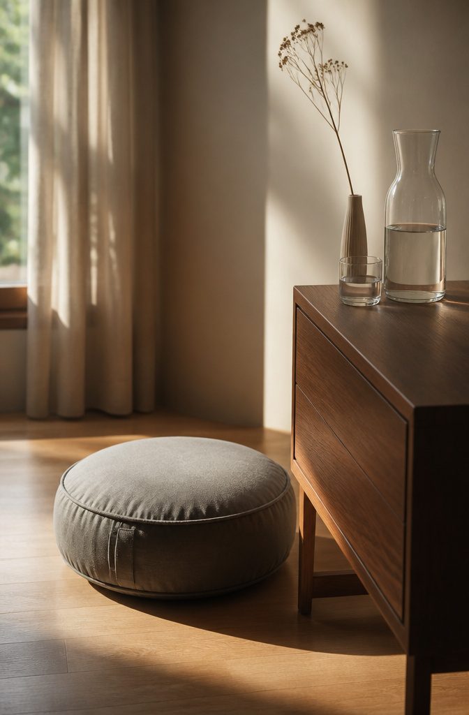
A cleaning inspo aesthetic lives in what you leave out, not what you add.
The objects that matter are the ones you touch every day: a meditation cushion in a corner where the light falls flat in the afternoon, a carafe and glass set on the nightstand, a single dried stem in a vase narrow enough to fit a windowsill.
I would skip the matching set. Mismatched glass and ceramic read as habit, not staging.
The practice is what makes the room feel tended.
Three objects in a bedroom beats a dozen that collect dust while you mean to start tomorrow. I think the carafe matters most because it asks for refilling, and refilling is a small motion that proves someone lives here deliberately.
For renters, this is the cheapest calm available.
No install, no landlord conversation. The cushion covers a scuffed floor; the vase draws the eye from a dated baseboard.
What fails is the shelf of unused journals and the essential oil diffuser that hums empty. If the ritual is not happening, the object becomes clutter faster than anything else.
20. Crisp Living Room Reset

The living room is where most of us let things drift, so the reset starts there. Pull every item off surfaces and onto the floor.
Books, remotes, candles, the mail you meant to sort, the decorative bowl that became a junk catcher. Seeing it all in one pile changes how you judge it.
Return only what has a daily purpose or a spot it belongs to. Everything else sits in a bin for the evening.
The one-category edit is what makes this feel finished, not just shuffled. Pick one group, magazines or throw pillows or the tchotchkes on the mantel, and remove half.
Choose whatever has multiplied since the last time you looked. The room does not need more storage; it needs fewer objects competing for the same visual space.
Nothing new comes in during this session. No reordering online, no "this would look better if" shopping.
The crispness is subtraction, and subtraction is free. A bare coffee table reads as intentional faster than a styled one, because there is nothing to read wrong.
Frequently Asked Questions
What are some ideas for a clean room aesthetic?
Each idea emphasizes restraint, material honesty, and daily habits over staging or shopping.
How can I maintain a clean and organized space?
A 10-minute evening reset restores your space to its baseline before bed: put away stray items, wipe counters, and plump cushions.
Starting each day with a clean environment reduces morning stress and prevents clutter from accumulating. Feather inserts in cushions return their loft with a single shake, and keeping surfaces to one anchor object means less to move when you clean.
Why are clean room aesthetic videos so popular?
These videos satisfy our need for instant gratification while offering the therapeutic relief of watching someone else create order from mess.
Viewers feel inspired to emulate the transformation, and the before-and-after format gives hope for their own spaces. The universal desire for a clean, organized space that signals life control drives broad appeal across platforms.
What is the 5-5-5 rule for cleaning?
A 10-minute evening reset and the one-in, one-out rule for decorative objects serve a similar purpose: manageable daily actions that prevent overwhelming buildup.
Is $50 an hour for cleaning good?
It focuses on DIY aesthetic upgrades under $150 for renters, such as sourcing glass jars from restaurant supply stores rather than boutiques for a laundry area refresh.
What is aesthetic cleaning?
Aesthetic cleaning is the practice of making maintenance itself visually satisfying and calm-inducing, not just the end result.
It means choosing black metal dustpans that read as sculptural, folding dish racks flat against backsplashes, and transferring toiletries into matching bottles so labels disappear.
The cleaning inspo aesthetic lives in these daily objects and habits, not in a single deep clean.
How to be an aesthetic clean girl?
The cleaning inspo aesthetic centers on restraint and material consistency rather than a specific persona.
Keep visible objects to one per surface, share a material language across finishes like black metal and matte white ceramic, and maintain a 10-minute evening reset.
Rolled white towels on a wooden stool, transferred toiletries in amber glass, and linen bedding with intentional rumple signal planned calm without performative perfection.