

I’ve stared at rug swatches until my eyes crossed, and I want to save you from that design hell. Start by auditing your room’s existing colors: walls, sofa, floors, textiles. Look for dominant hues and undertones. Then pick your strategy: match for cohesion, contrast for drama, or bridge for that soft, unified vibe. Let your floor tone narrow the field. Dark floors crave lighter rugs; light floors need depth. Test swatches obsessively under morning sun, overhead glare, and that weird 9pm lamplight that makes everything look haunted. Material matters too. Wool stays saturated, synthetics go flat, jute mutes everything earthy. Scale patterns to your space: tiny rooms need delicate prints, big rooms swallow bold motifs whole. Tape fabric samples to your floor, photograph them hourly, record the shifts. Layer carefully: natural fiber base, patterned top, one shared hue tying them together. Live with your choice for 24 full hours before committing. Your rug’s true colors emerge when you’re sipping morning coffee and watching shadows crawl across the surface.
Audit Your Room’s Colors Before Shopping

Where do I even start with rug shopping? You can’t just wing it. Before I even browse, I audit colors in my space: walls, sofa, floors, every textile. Those dominant hues and sneaky undertones will make or break your whole vibe.
I always do a swatch test, because lighting tricks me every time. Morning daylight, that harsh overhead bulb, my cozy lamp. They all shift how colors read. I’ll tape samples near my floor pairing and check contrast at different hours. Higher contrast makes the rug pop, while similar tones melt everything together so peacefully.
I’ve bought gorgeous rugs that looked awful at home. Now I evaluate what my room actually needs: anchoring, blending, warmth. Then I test obsessively. Your eclectic choices deserve this preparation.
Match, Contrast, or Bridge: Pick Your Color Strategy
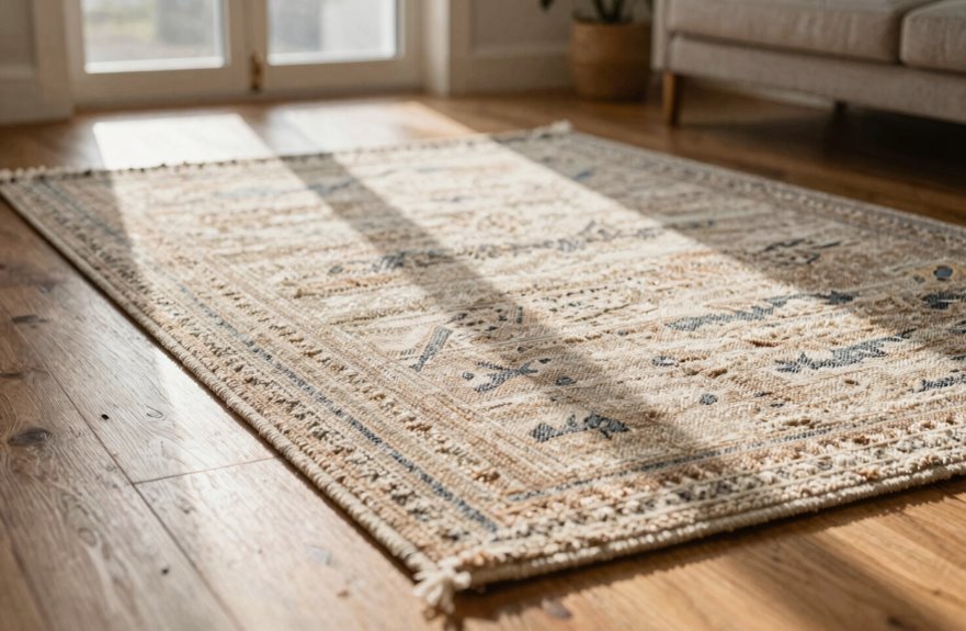
I’m so excited to walk you through this part, because picking between matching and contrasting is where I’ve personally made the biggest messes and learned the most. When I match a rug to my sofa’s dusty blue, everything melts together like a cozy, intentional hug, but when I contrast, think charcoal floors against a creamy ivory weave, I suddenly see my coffee table actually exists as its own little island. I once bought a “safe” beige that practically vanished into my oak floors, a total rookie move, so now I’m team contrast unless I’m deliberately chasing that soft, blended vibe.
Color Matching Strategy
How do you even begin when the paint swatches are staring back like a judgmental crowd? I grab my matching strategy and dive straight into rug color matching. It’s like finding your people at a party. I pull hues from my existing elements, maybe that dusty blue sofa or those terracotta throw pillows, and build a cohesive color palette that wraps the room in a warm hug.
| Strategy | What I Actually Do | The Vibe It Creates |
|---|---|---|
| Match | I sample my sofa’s sage, go one shade lighter | Smooth, calm, intentional |
| Tonal Variation | I avoid exact duplicates—no “melting floor” here! | Depth without chaos |
| Bridge | I pick up the wall’s cream, add muted coral | Unity between clashing pieces |
| Complementary Hues | I test against my wood floors’ undertones | Everything finally “talks” |
| Room Cohesion | I step back, squint, feel that sigh of relief | Belonging, achieved! |
Tonal variation prevents flatness and keeps eyes moving across the room.
Contrast Selection Method
There’s something almost rebellious about finally admitting you don’t have to play it safe with your rug color. I used to match everything, boring myself to tears, until I discovered rug color contrast changes everything.
The contrast strategy demands real tonal difference. Think indigo slapped against honey oak floors, that delicious warm vs cool tension that makes guests stop mid-step. You’re creating a focal point, pure and simple, giving your space definition that signals intentional design choices.
The bridge strategy offers another approach. When your sofa battles your walls, pick a rug sitting between those dominant hues. It unifies without screaming, achieves color harmony through subtle connection, and creates furniture contrast that feels intentional rather than accidental. Your room will benefit from this layered approach.
Let Your Floor Color Narrow Your Options

Where do I even start when the floor’s already doing half the talking? Your floor color isn’t the enemy; it’s your first filter through the overwhelming sea of rug color options.
I once bought a gorgeous caramel rug that completely disappeared into my honey oak floors. Total disaster. Contrast defines the room. Warm wood floors call for warm rug hues like terracotta or beige that harmonize without matching exactly. Cool gray tile pairs beautifully with blues and creams.
For dark floors, I choose lighter or more saturated colors to brighten things up. Light floors need deeper tones like navy or emerald to create depth. I always grab rug swatches, toss them down, and run a quick lighting test. Color interaction changes the final result dramatically.
Check How Light Changes Your Rug Color
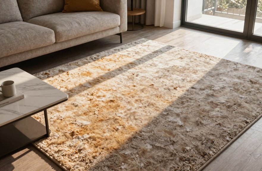
I learned this the hard way when my “perfect” sage rug turned swampy green at 6 PM, so now I always tape swatches to the floor and observe them at sunrise, noon, and lamp time. Natural light reveals true color by showing real saturation, but that cozy 2700 K bulb you’re using masks reality by adding amber warmth until your cool gray reads as beige. Snap photos under each condition, compare them side by side, and don’t let your evening lighting push you into a choice you’ll regret by morning. Evening light can shift your perception enough to create costly mistakes.
Natural Light Impact
Daylight deception is the sneakiest trick your windows play on you. I learned this the hard way with a “perfect” sage rug that turned muddy olive by 4 p.m.
Natural light reveals true undertones you simply can’t catch under artificial bulbs. Test every rug in both morning light and late-day light because shade shifts happen, sometimes one or two intensities. Hold that swatch against your actual flooring; daylight exposes subtle color saturation changes you’d otherwise miss.
Photograph your rug as the sun moves across your room. Those lighting conditions transform everything. If your space lacks big windows, choose moderate color saturation so your rug stays readable even on gloomy days. A rug that shifts dramatically between lighting conditions will feel like a different piece each time of day.
Artificial Light Effects
Flip the switch at 7 p.m. and watch your “neutral” beige rug turn into a pumpkin spice disaster. Artificial light changes everything, and lighting temperature is the culprit.
Here’s what happens in your space:
- Warm bulbs (2700K) push colors toward yellow and gold, hiding that cool gray undertone you loved
- Cool daylight (4000-5000K) pulls out blues and silvers you never knew existed
- Mixing sources creates chaos. Your lamp says cozy, your ceiling says clinical, and neither matches the window.
Daylight shows true color, but we’re home at night. Swatch testing matters because it eliminates guesswork. Grab physical swatches, place them where the rug will live, and check under every bulb. Warm versus cool isn’t abstract. It’s the difference between spending money on a color that doesn’t work in your space and selecting one that actually coordinates with your lighting conditions.
Choose Rug Material First: It Affects Color

Material choice is the concealed asset most people skip right past. I used to be totally obsessed with finding the perfect shade of navy while completely ignoring what that navy was actually sitting on.
Natural fibers completely transform color perception. Wool rugs absorb dye deeply, giving you that lush, saturated blue. Synthetic fibers flatten gorgeous jewel tones into sad office carpet energy, especially on low pile height where there’s nowhere for light to hide. Flatweave construction spreads color thin and even, which is pretty but never plush.
Jute and sisal mute everything earthy, which works well if you want subtle tones but falls short if you crave drama. Construction method decides whether your red reads scarlet or washed-out brick. Hand-knotted wool holds color saturation for years; machine-made synthetics fade noticeably over time.
Pick Solid, Patterned, or Textured Based on Traffic
How do you actually live in your space? That’s the real question that decides whether I’m reaching for a quiet solid, a bold pattern, or something with juicy texture. I’m sharing my rug color selection approach because we’ve all got that one hallway that looks like a stampede hit it.
Here’s my real-life breakdown:
- Solid rug in soft gray or beige hides wear in high-traffic areas effectively. Neutral tones blend with furniture rather than competing with it.
- Patterned rugs with busy prints provide color camouflage for crumbs, paw prints, and kid chaos. Practical beauty that accommodates everyday mess.
- Textured rug with woven depth hides footprints even in one color. Tufted bumps add cozy dimension and make floors feel intentional.
I’m always picking durable materials like wool or dense synthetics so my choice actually lasts. Room anchoring happens when I’m honest about my real life, not my Pinterest fantasy.
Scale Pattern Size to Your Room Dimensions
I learned this the hard way after cramming a huge, busy medallion rug into my tiny guest room. It felt overwhelming. Now I stick to this simple rule: small rooms need small patterns (think delicate geometrics or tight florals), while big, airy spaces can handle bold, oversized designs that actually ground the furniture instead of fighting it. To determine what works best, grab some painter’s tape, outline different pattern sizes on your floor, and you’ll see what feels right before you spend a dime.
Small Room, Small Pattern
The quickest way to make your cozy bedroom feel like a clown car? Throw down a rug with patterns so huge they swallow your nightstand whole. In a small room, small pattern choices aren’t just cute; they’re survival tactics.
Here’s what actually works when you’re scaling down:
- Lighter base colors that bounce light around like a friendly mirror
- Subtle motifs you notice after your second coffee, not your first step
- Proportionate scale where the pattern repeats feel intimate, not aggressive
I tape out my rug dimensions with painter’s tape now, because seeing the scale against your actual furniture saves you from visual crowding that shrinks your space. Openness feels like luxury when you’re working with square footage that barely fits your dreams.
Large Room, Bold Pattern
A cavernous living room with a timid little rug is like wearing a whisper to a rock concert. Nobody notices, and you just feel silly. I’ve been there, squinting at my poor lost rectangle drowning in all that floor.
In a large room, you need a bold pattern with oversized motifs and generous repeats that fill the space without exhausting your eyes.
I always check my lighting first. Dim corners swallow patterns whole, so I increase contrast against my floor color. My oak floors pair well with deep navy geometrics that create visual interest. The trick is letting that rug color anchor your seating group and create focal points that step down visually without overwhelming the space. Pair with quieter furniture, find your balance, and the room becomes cozy and intentional.
Furniture Scale Matters
Because I’ve made this mistake more times than I care to admit, a tiny trellis pattern under my giant sectional looked like a dollhouse rug having an identity crisis. My friend didn’t say anything, but her eyebrow did. Furniture scale and pattern scale must work together, or your whole room feels off.
Here’s how I get it right now:
- Match your rug size to your seating arrangement. Nothing is worse than front legs floating like they’re embarrassed to commit.
- In open-plan spaces, let room proportions guide you; oversized patterns create large-room balance when you’ve got breathing room.
- Use visual anchoring. An expansive motif grounds sprawling furniture, while compact patterns cozy up tight clusters.
Get this dance right, and suddenly everyone gathers at your place.
Test Colors With Tape and Fabric Swatches
How do you know a rug actually works until you’ve walked around it, stared at it, judged it at 7 AM with coffee in hand? Showroom lighting deceives. That’s why tape swatches matter: actual painter’s tape outlining where the rug lives, so you can feel the space before spending a dime.
| Testing Method | What It Reveals |
|---|---|
| Tape rectangles on floor | Traffic flow, furniture anchoring |
| Fabric swatches vs. floor tones | Color harmony under real conditions |
| Photo color grid, morning to night | Mood balance across lighting conditions |
I tape two or three options, creating a mini color grid right there on my hardwood. Then I photograph everything: 7 AM golden light, 3 PM harsh sun, 9 PM lamplight. Color testing requires catching those shifts. Warm beige turns cold gray by dusk. I’ve prevented countless mistakes this way.
Compare your swatches to curtains, sofas, and that throw pillow you love. Record everything: hue, saturation, warmth. You’ll make decisions based on actual data rather than guesswork.
Layer Rugs Without Color Chaos
Once I mastered single rugs, I got greedy—two rugs, one room, double the trouble and twice the payoff. Layering rugs lets me carve zones in my open space, but I’ve learned color chaos lurks around every corner.
Two rugs, one room, double the trouble and twice the payoff—but color chaos lurks around every corner.
Here’s my survival kit:
- Anchor with a base — I start with a larger natural fiber underlay, then crown it with a smaller patterned rug that winks at my sofa pillows.
- Find your thread — I hunt for one shared hue between both pieces, weaving color harmony through my room palette like a secret handshake.
- Play opposites — I pair that bold geometric underlay with a solid rug on top, because contrasting scales create depth without the clash.
I tape everything first, because rug placement commits are scary. When your layered rugs work together, the coordinated colors and balanced scales create a polished, intentional look.
Live With Your Choice for 24 Hours
Where do I even start now that I’ve narrowed it down? I live with my choice for 24 hours, minimum. No exceptions. I tape swatches to the floor, step back, and watch the magic or disaster unfold.
Morning light hits different than that cozy 2700K lamp glow. My rug color shifts dramatically. I’ve seen warm tones turn muddy and cool grays go lavender. Lighting changes everything. I snap photos at 9am, 3pm, and midnight, comparing color perception like a detective.
I check room cohesion constantly. Does my rug and décor actually talk to each other, or are they having separate conversations? I move furniture and pretend I’m hosting friends. I ask myself; does this feel like me?
After 24 hours, I know. The right choice makes my space feel complete and welcoming, reflecting who I am.